Best 30 Office Colour Combination: Vastu Tips | Trends 2025
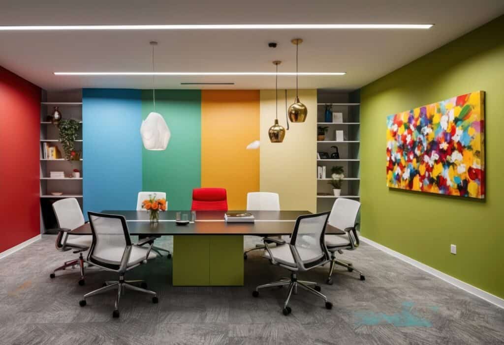
When it comes to designing a shop or office, colours play an essential role in setting the tone, enhancing productivity, and aligning with Vastu Shastra principles. A well-thought-out office colour combination not only reflects your business identity but also creates an atmosphere that positively influences employees, clients, and customers.
In this blog, we’ll explore 30 office colour combinations, discuss how to balance colours, dive into Vastu tips, and provide insights into trends to help you select the ideal colour palette. By the end, you’ll have a clear idea of which colours to choose for your interiors and exteriors.
Understanding Vastu for Shop and Office
Vastu Shastra emphasizes the placement of colours to attract positivity and prosperity. According to Vastu:
- North-facing offices should use light shades of green and blue, which symbolize growth and creativity.
- East-facing offices benefit from earthy tones like beige or cream to foster stability.
- South-facing offices should have warm colours like red, orange, and pink for energy and ambition.
- West-facing offices can incorporate white, silver, or grey to promote balance and clarity.
Key Vastu Tips for Colours in Shops and Offices
- Reception Area: Use welcoming colours like beige, light yellow, or pastel shades to create a warm first impression.
- Meeting Rooms: Opt for shades of blue or green to encourage calm and focus.
- Workspaces: Incorporate colours like white, light grey, or cream to promote concentration and reduce stress.
- Cash Counters: Choose vibrant shades like gold or red to attract wealth.
- Exterior Colours: Stick to neutral colours like white or cream to maintain harmony.
Balancing colors with Vastu principles ensures not just aesthetic appeal but also enhanced functionality and prosperity.
The Role of Colour Psychology in Office Design
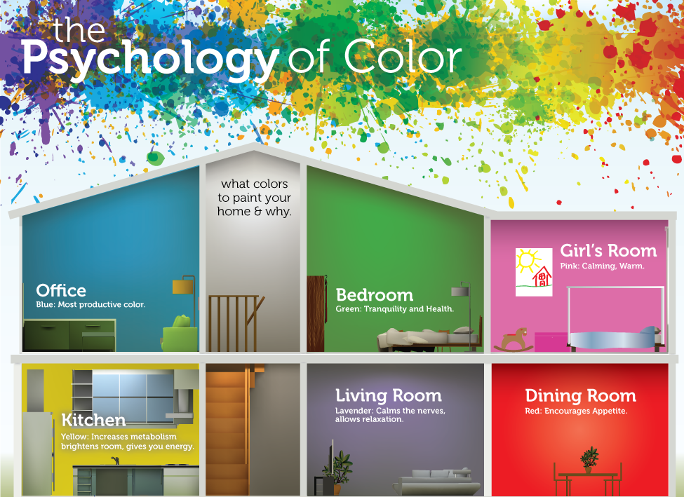
Colours affect mood and behavior. Here’s a breakdown of how popular office colours impact people:
- Blue: Increases focus, communication, and trust.
- Green: Enhances balance and reduces stress.
- Yellow: Boosts energy and optimism.
- Red: Encourages ambition and passion.
- White: Signifies clarity and simplicity.
- Grey: Promotes professionalism and neutrality.
Choosing the right office color scheme ideas ensures that your office environment remains productive, inspiring, and visually appealing.
Trending Colour Combinations for Offices in 2025
The world of office interiors is constantly evolving. Here are the hottest trends for 2025:
- Earthy Tones with Metallic Accents: Think terracotta with copper highlights for a grounded yet chic look.
- Dual-Toned Walls: Combining complementary colours like navy blue and pastel pink creates depth and modernity.
- Muted Pastels: Colours like dusty blue, sage green, and mauve dominate for their calming effects.
- Monochromatic Themes: Use different shades of a single colour, like grey or beige, for a minimalist vibe.
- Statement Ceilings: Add bold colours to ceilings while keeping the walls neutral.
The Do’s and Don’ts of Choosing Office Colours
Do’s:
- Consider the functionality of the space while selecting colours.
- Use light colours in smaller spaces to make them feel larger.
- Integrate your brand colours subtly into the interiors.
- Experiment with contrasts to create visual interest.
- Opt for colours that align with Vastu principles to enhance positivity.
Don’ts:
- Avoid overly dark colours as dominant tones—they can make the space feel closed-in.
- Don’t neglect natural lighting when choosing your palette.
- Refrain from using too many bold colours; they can overwhelm the senses
30 Office Colour Combinations for Interiors and Exteriors
Here’s a comprehensive list of office colour combination ideas for a variety of themes and purposes:
Blue and White
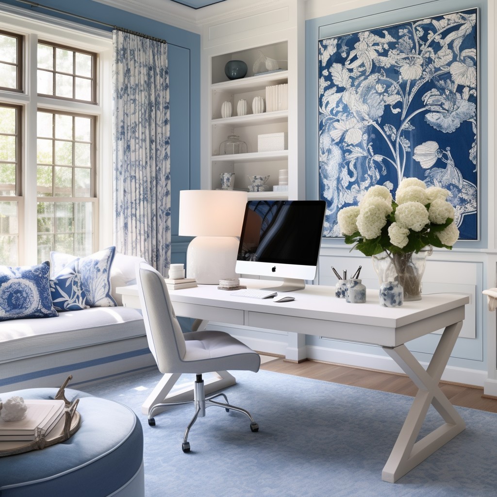
A calming and classic combination, perfect for creating a tranquil and focused work environment. Blue promotes trust and productivity, while white adds simplicity.
Grey and Yellow

A modern blend that balances neutrality with energy. Grey brings professionalism, while yellow adds a cheerful and creative vibe.
Green and Brown
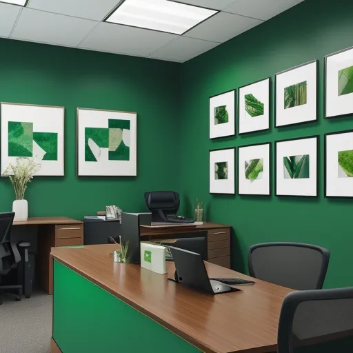
Inspired by nature, this combination creates a grounded and organic feel. Green symbolizes growth, while brown adds warmth.
Black and White
Timeless and sophisticated, this combo is ideal for professional and high-end office designs. Black adds drama, while white ensures balance.
Beige and Teal
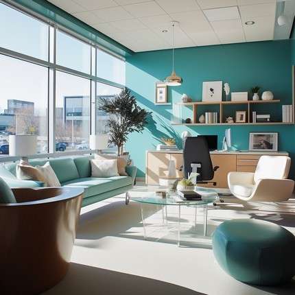
A neutral palette with a pop of creativity. Beige maintains subtlety, while teal introduces a refreshing and unique accent.
Charcoal Grey and Light Beige
:max_bytes(150000):strip_icc()/decorating-with-charcoal-gray-797898-hero-d1f14ac2bf004e3c9e17fe75004f6543.jpg)
For subtle sophistication, charcoal grey brings depth, while light beige softens the overall aesthetic.
Navy Blue and Gold

A luxurious and bold duo, navy blue provides a strong base, while gold adds an opulent and stylish accent.
White and Pastel Pink

This soft and inviting palette is ideal for a calming, feminine, and welcoming office environment.
Yellow and Black
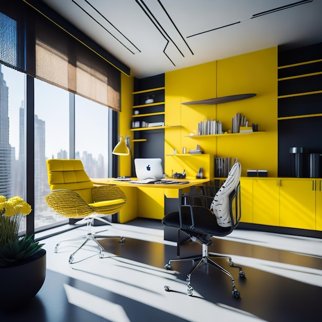
Perfect for energy and attention-grabbing spaces. Yellow stimulates creativity, while black offers a strong contrast.
Beige and Olive Green
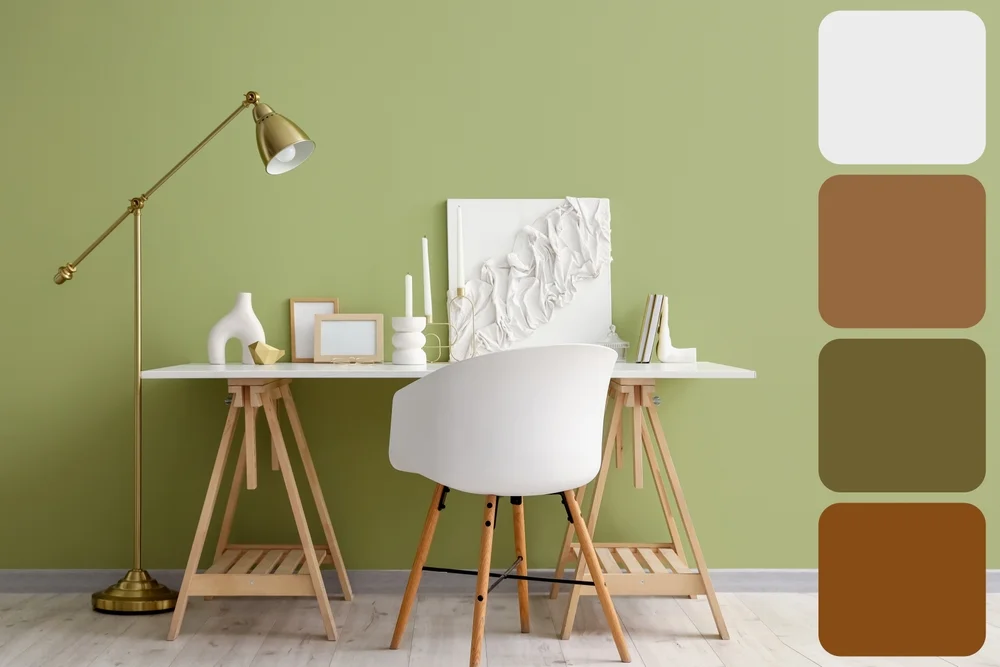
A warm and grounding combination. Beige creates a cozy atmosphere, while olive green adds an earthy tone.
White and Light Blue
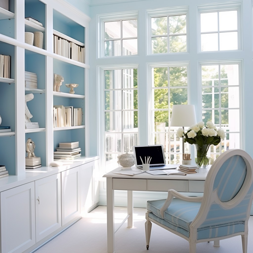
A calm and focused duo that promotes clarity and tranquility. Ideal for workspaces requiring concentration.
Terracotta and Cream
This traditional yet earthy palette combines the richness of terracotta with the simplicity of cream, creating a cozy ambiance.
Dark Green and Grey
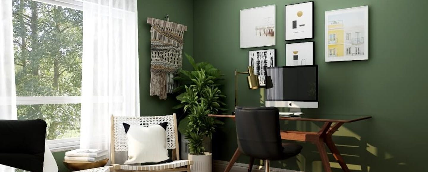
A sleek and modern combination. Dark green conveys sophistication, while grey balances with neutrality.
Red and White
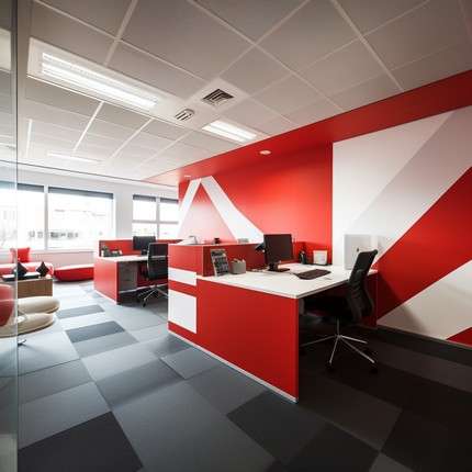
This energetic pairing is bold yet balanced. Red ignites passion and ambition, while white ensures a clean backdrop.
Brown and Beige
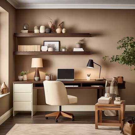
For natural and inviting spaces, brown adds richness while beige keeps the environment light and welcoming.
Turquoise and White

A refreshing and clean combination, turquoise introduces vibrancy while white maintains simplicity.
Light Purple and Grey
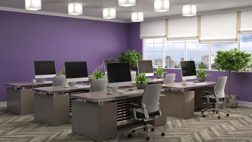
Creative and elegant, this pairing blends the softness of purple with the seriousness of grey.
Orange and White

A cheerful and vibrant palette. Orange stimulates enthusiasm, while white ensures balance.
Beige and Lavender

A subtle and calming combination. Beige adds warmth, while lavender brings a soothing and creative vibe.
White and Dark Green

This sophisticated and earthy palette combines the freshness of white with the richness of dark green.
Peach and Cream
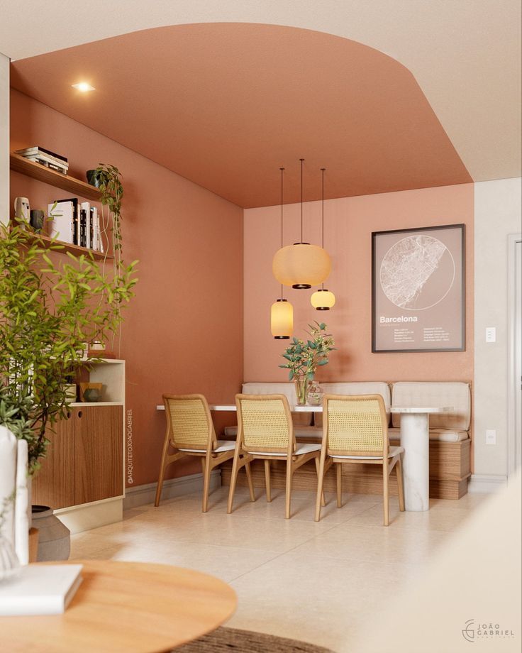
Gentle and warm, peach infuses softness, while cream enhances brightness. Ideal for relaxed spaces.
Black and Gold
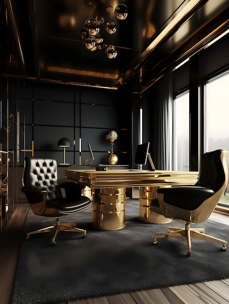
A bold and luxurious pairing. Black adds drama, while gold introduces a high-end, glamorous touch.
Sky Blue and Grey
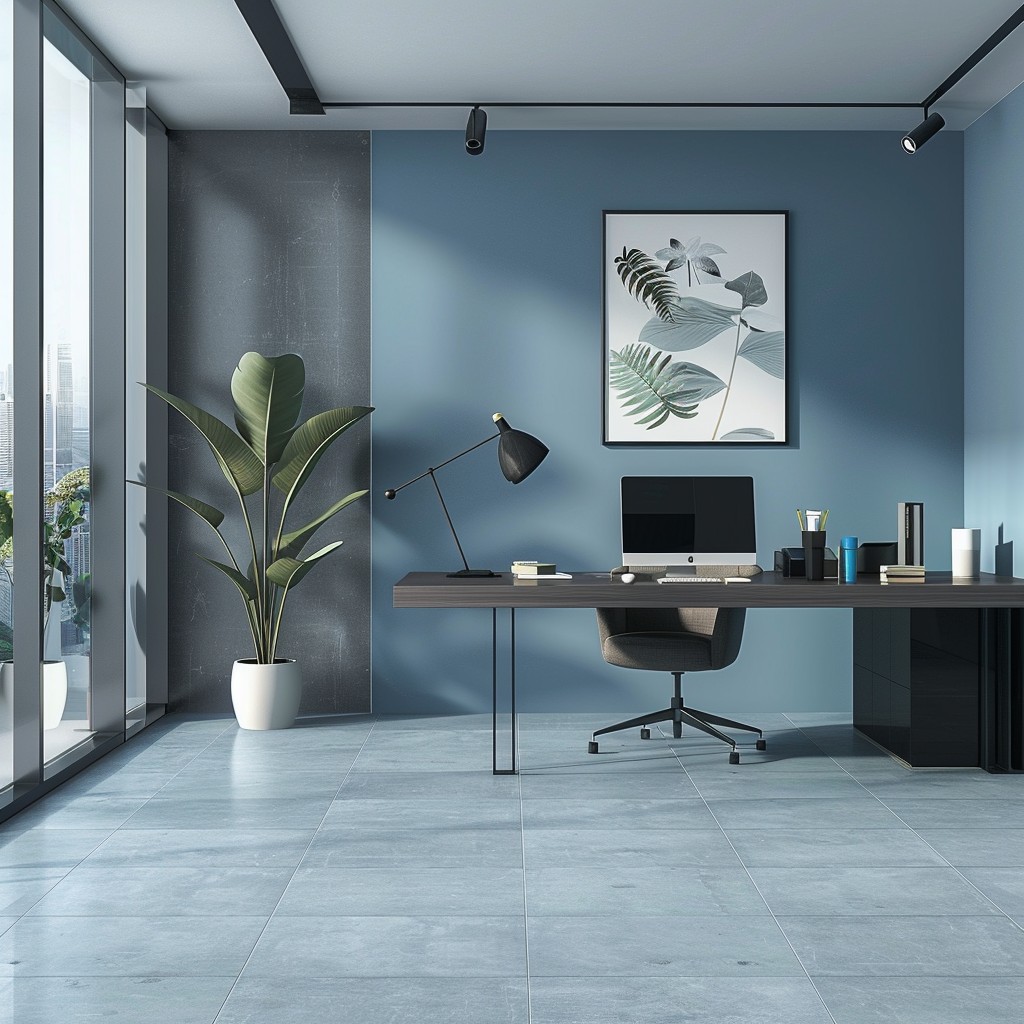
Relaxed and professional, this combination balances the calmness of sky blue with the neutrality of grey.
Yellow and Grey
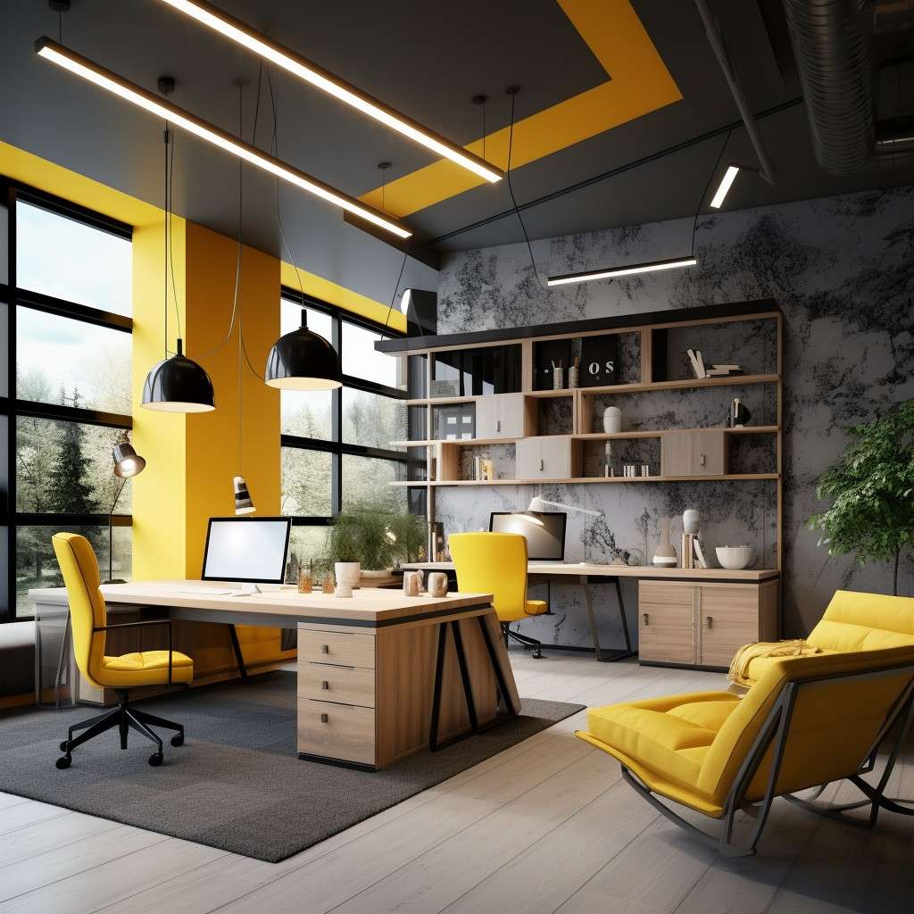
Energetic yet modern, yellow adds brightness while grey provides a subdued contrast.
Ivory and Mint Green
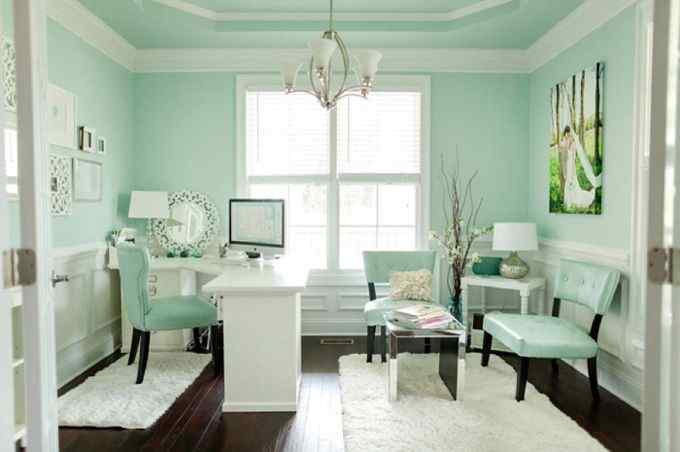
Light and refreshing, ivory keeps it subtle, while mint green adds a lively and fresh accent.
Navy Blue and Light Grey

Sharp and formal, navy blue conveys authority, while light grey ensures balance and neutrality.
Brown and Gold
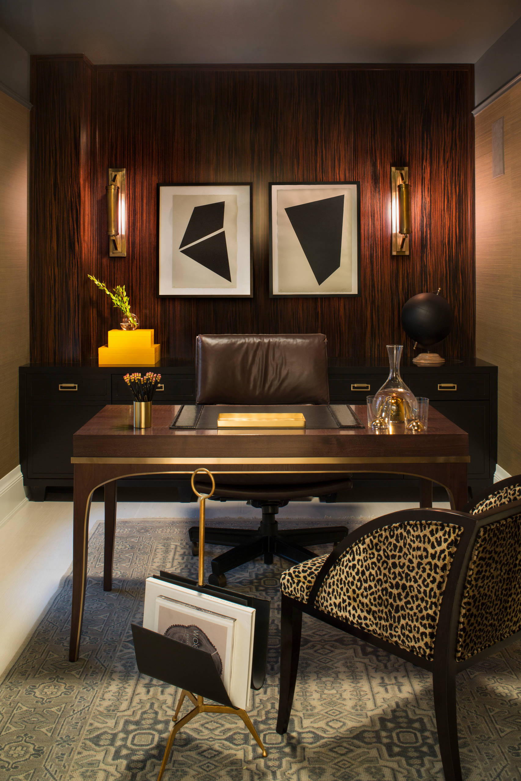
A traditional palette elevated with a luxurious touch. Brown adds warmth, while gold offers a rich, opulent highlight.
White and Charcoal Grey
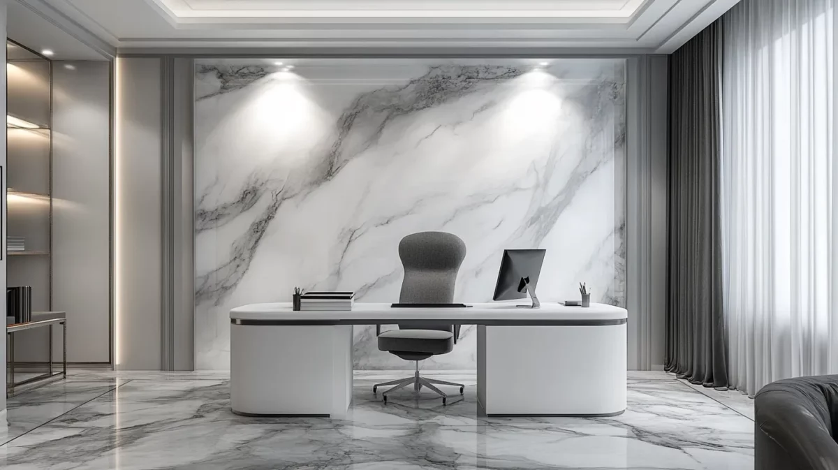
Minimalist and chic, this pairing combines the brightness of white with the depth of charcoal grey.
Mustard Yellow and White
Cheerful and balanced, mustard yellow adds a pop of energy, while white keeps it fresh and light.
Beige and Coral
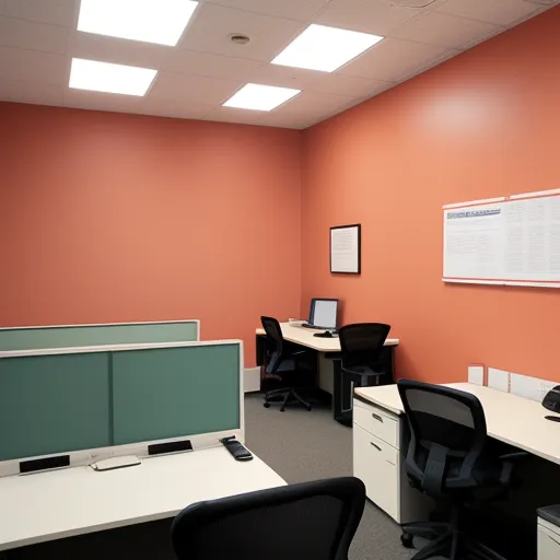
A subtle and youthful palette. Beige keeps it neutral, while coral adds a soft, playful touch.
This wide variety of colour combination ideas can suit diverse business needs. Whether for office colour combinations for men or general use, these combos work seamlessly for interiors and exteriors.
How to Use Colours in Branding
Your office colours can be an extension of your brand’s identity. For instance:
- A tech company can lean on blue shades for trust and dependability.
- Creative agencies can explore vibrant shades like orange or green for innovation.
- Law firms and financial institutions often prefer neutral tones like grey, black, and white for professionalism.
Tips for Balancing Office Colours
Balancing colours ensures harmony and prevents overstimulation. Follow these tips:
- Apply the 60-30-10 Rule: Use 60% of one dominant colour, 30% of a secondary shade, and 10% for accent colours.
- Contrast Wisely: Pair bold colours with neutrals to maintain balance.
- Consider Lighting: Test colours in different lighting conditions before finalizing.
- Incorporate White: Office colour combination ideas with white are timeless and versatile.
- Stay True to Your Brand: Use colours that align with your brand’s identity.
Conclusion
Choosing the perfect office colour combination is more than just an aesthetic decision—it’s about creating a space that inspires productivity, positivity, and success. Whether you prefer bold contrasts or subtle hues, these office colour scheme ideas provide endless possibilities to design the ideal workspace.
At Housiey, we’re committed to making your home or office design journey smooth and hassle-free. Ready to explore more insights?
Don’t miss our blog on the Vastu for Shop Tips: East | West | North | South Facing Showrooms
FAQs
- Bright and warm colours like yellow and orange enhance energy, while calming shades like blue and green promote focus.
- Light shades like white, beige, or pastel colours create an illusion of space, making the office appear larger.
- This rule involves using 60% of a dominant colour, 30% of a secondary shade, and 10% for accents, ensuring balance.
- Yes, bold colours like navy blue, dark green, or mustard can be used strategically as accent walls or furniture pieces.
- Avoid excessive black or dark shades, as they can create negativity if not balanced with lighter tones.
- Contrasting colours like grey and yellow or blue and white can create a dynamic and appealing workspace.
- Warm and vibrant colours like red and yellow attract customers, while cooler shades like blue build trust.
- Shades of red, gold, or green are considered auspicious and are believed to attract wealth.
- Neutral tones like white, beige, and grey create a balanced and professional look suitable for all business types.
- Natural lighting enhances lighter shades, while artificial lighting can alter how colours appear, making testing essential.
- Yes, pastel colours like lavender, mint green, and soft pink create a soothing and friendly workspace.
- Vibrant colours like orange, yellow, and turquoise inspire creativity and innovation.
- Yes, darker shades absorb light and can make a space feel smaller if overused.
- Use brand colours on feature walls, furniture, or decor items to reflect your identity subtly.
- Cool shades like blue and green create a calm and focused atmosphere, ideal for discussions.
- Yes, bold or contrasting colours on ceilings are increasingly popular for adding personality to offices.
- Absolutely, neutral or professional tones like white, beige, or grey give a clean, professional look to the office exterior.
- Vibrant colours like red, orange, and yellow attract customers and create a lively shopping experience.
- White and charcoal grey or beige and light grey are ideal for achieving a minimalistic look.
- Flooring complements the wall colours. Wooden floors work with warm tones, while light tiles pair well with cool shades.
I am Zeeshan Qureshi, a dedicated content writer for Housiey.com, passionate about simplifying the home-buying journey for everyone. With strong expertise in the real estate industry, I strive to offer transparent, reliable, and up-to-date information that empowers homebuyers to make smart property decisions.
My articles, guides, and project reviews reinforce Housiey’s core values—No Brokerage Policy and Bottom Rate Guarantee—ensuring every reader gets genuine market insight, legal clarity, and the most recent trends.
Through Housiey Blogs, I aim to provide readers with valuable knowledge on topics like Real Estate Law, RERA, Stamp Duty, Home Loans, Vastu Tips, and the latest property market updates, blending useful information with a touch of lifestyle, sports, and entertainment content.
Specialization: Project analysis, government policy explainers, financial guidance, home design tips.
Mission: To empower Indian families with trustworthy knowledge for their dream home purchase.
Writing Style: Making complex real estate topics easily understandable and engaging for every reader.
If you are seeking answers to your property questions or want to stay updated with the latest real estate trends, stay connected with Housiey Blogs—where you’ll always find insight, trust, and real-world guidance.

